Initial identity concepts
Initial identity concepts
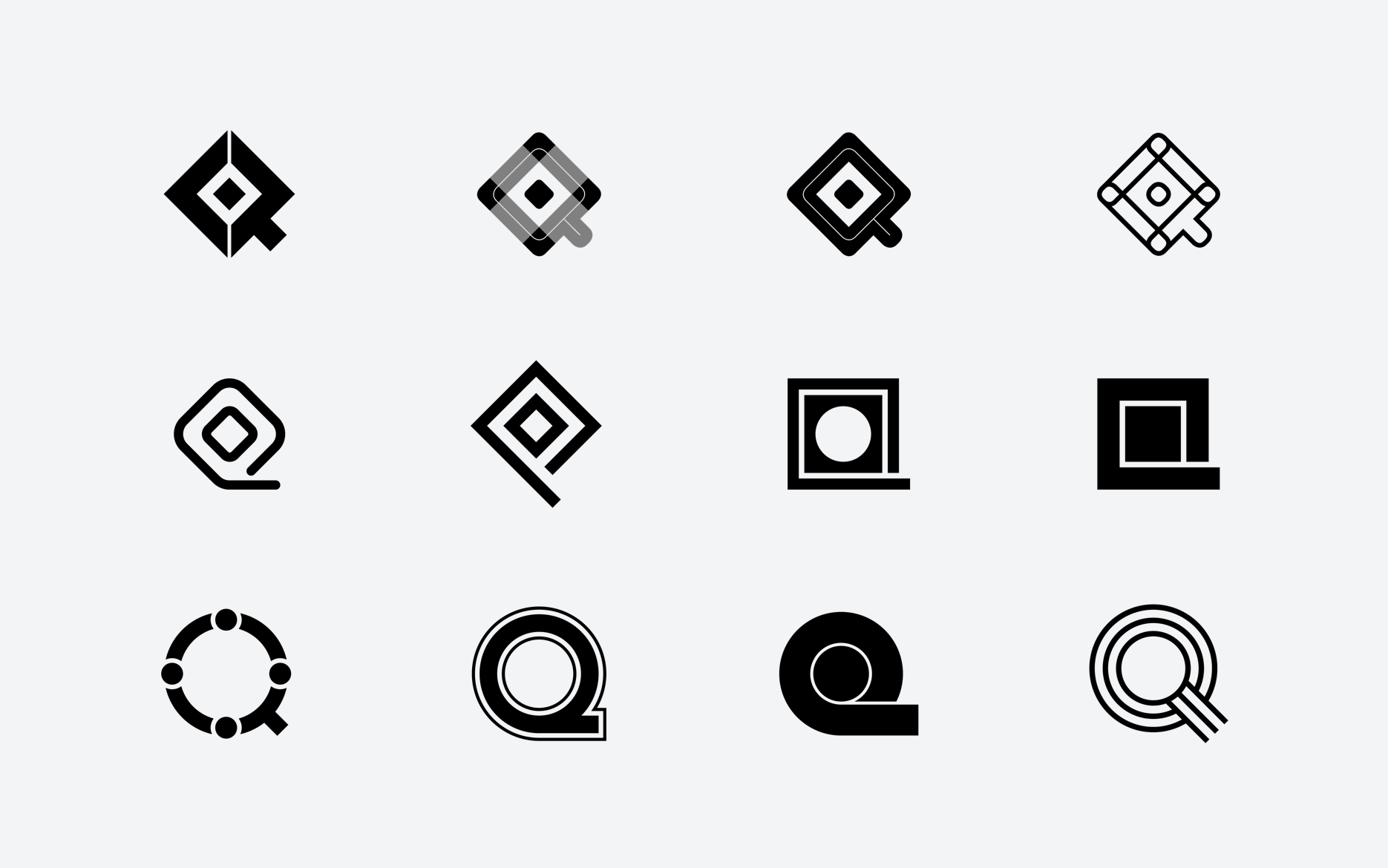
Mark explorations

Brand guidelines

Sub-brand logos

Event badges

T-shirt
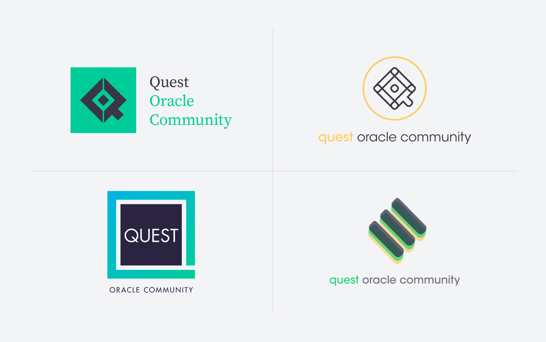
Quest needed to adapt to changing market conditions in order to continue growing its member base. The growing popularity of Oracle Cloud software created the need to support a new demographic of customers. Because of the segmentation between the different Oracle products and users, Quest needed an identity system that could easily differentiate content and users based on their primary software type.
Taking into consideration the information gathered during an initial research phase, I developed and presented multiple branding concepts to Quest’s key stakeholders. The direction that was chosen draws inspiration from the visual vocabulary of software developers and updates and retains Quest’s use of green as a primary brand color. A complimentary color scheme connects parent and child logos while allowing each to maintain its own unique identity.
Agency: Sanborn
Role: Lead Designer
Tools: InDesign, Illustrator, Photoshop, Keynote
Typeface: Century Gothic

Marketing homepage
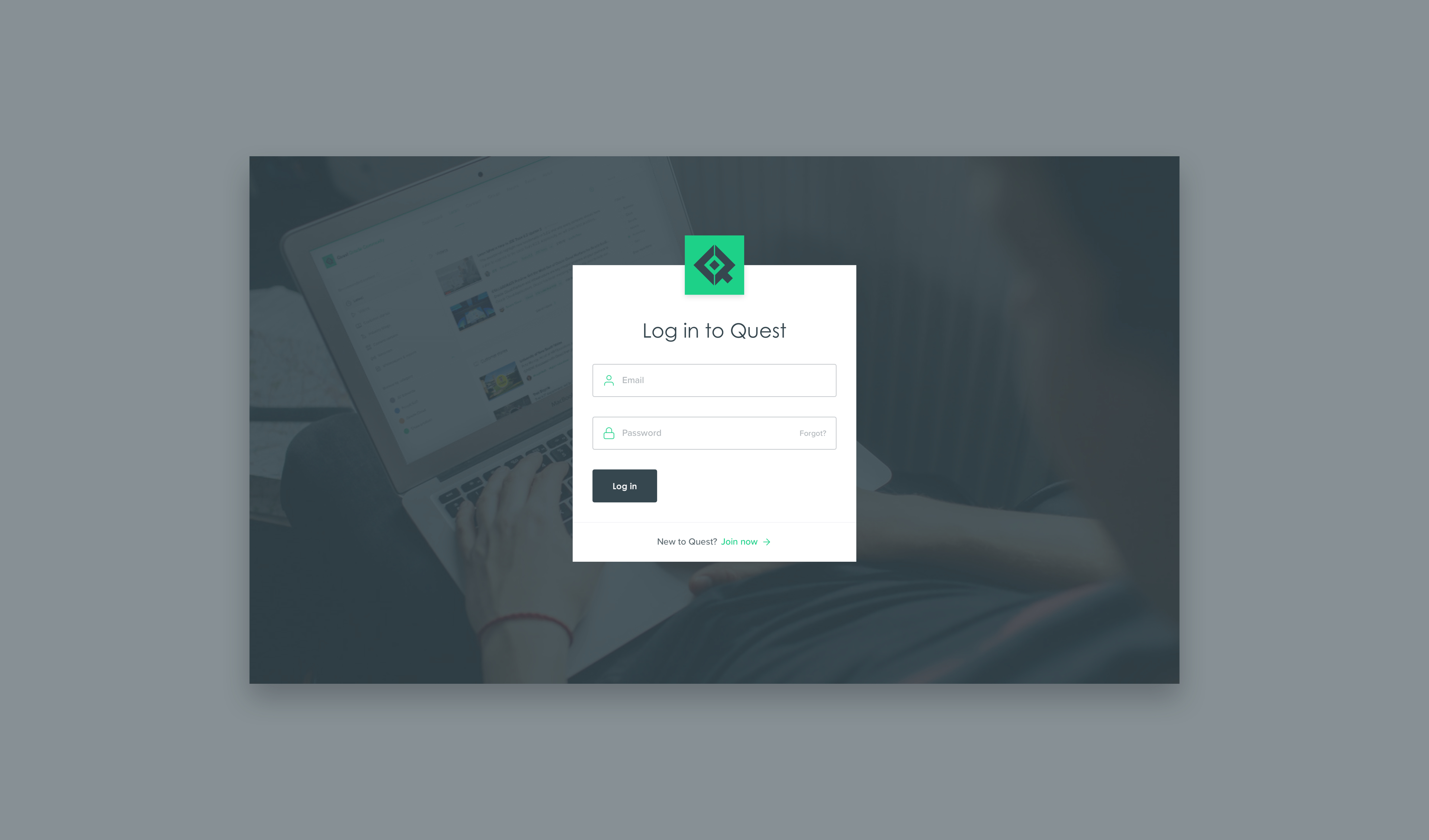
User login

User dashboard

Learn section

Connect section

Groups section

Forums section

Chats
Quest’s previous web experience had a lot of functionality but was executed in a way that made it hard for users to find what they need and difficult for staff to maintain such a large system. The process for overhauling Quest’s platform started with research and extensive wireframing. The site had to be designed in a way that would work within the technical restraints of the various integrations used by the engineering team, most notably WordPress and nodeBB. The building process began shortly after the completion of the wireframes, allowing the design process to take more of an agile approach.
The new platform uses the visual language system set forth in the rebranding to help identify and categorize content and users across the entire site. All areas of the platform can be easily browsed, filtered, and searched. Logged in users have a fully custom experience that allows them to access a customizable dashboard, browse content, connect with other users, join groups, participate in forums, and RSVP to events. A style library was created to bring consistency to the wide range of UI components. In addition to the user platform, a marketing site was designed with a focus on brand awareness and member acquisition.
Agency: Sanborn
Role: Lead Designer
Tools: Sketch, InVision, Craft, Anima, Plant
Typeface: Century Gothic, Proxima Nova